FAQ is originally an acronym* for Frequently Asked Question, but as often happens usage has drifted. In this particular case, marketing occasionally co-opts FAQ to mean, "A question contrived to produce the message we're really trying to get through as an answer." These range from fairly innocuous, like "Does your product support <some cool feature>?" or "How can I purchase <your wonderful product>?" to the more egregious, like "Is your product much more stable than <evil competitor's>?" ("Why yes, I'm glad you asked that question ...")
Either way it smells of Astroturf**. My personal reaction ranges from amusement, if the information is at least useful, to annoyance if it's not. But the question here today is, is there a word for it? My thought was "FAQE", but while a bit of googling indicates that other people have had the same idea, a bit more googling indicates that few, if any, people are actually using it that way.
And that's actually about as much time as I care to spend on the topic.
* If you pronounce it as a word, like NATO or WASP, it's an acronym, regardless of whether the word existed previously (WASP) or not (NATO). If you pronounce it as letters, like FBI or NBA, and you're feeling pedantic it's an initialism. If you're not, it's also an acronym.
** There should probably be a trademark in there someplace, even though we're not referring to the lovely green carpet used in sports stadiums. Please don't sue.
Friday, October 30, 2009
Monday, October 26, 2009
Sunday, October 25, 2009
On the importance of convention
What's going on in this picture? If you're from Todmorden, Lancashire, you'll probably know exactly what's up. If you're English or from some other place with a similar traffic system, you'll probably have a pretty good idea: Traffic keeps to the left, the triangles mean "yield", the arrows mean "go this way," of course, and the green circle is a mini-roundabout. If you're coming from the lower right, for example, and want to shift over to the inner roadway, you'll have to yield to anyone who might already be going round the green circle, then go round the green circle yourself to complete a right turn, yield to anyone on the inner roadway and turn left onto it.
All of this is encoded into the markings on the road, the little red triangular sign and, crucially, the minds of the road users who know how to interpret the markings. I should probably mention here that the road users in question are meant to be cyclists under the age of 12 and that grownup mini roundabouts are typically also clearly marked with arrows, not that everyone always takes notice.
To those of us on the other side of the pond, things might not be so obvious. The triangles are on the far side of the intersection if you're on the right, and they're pointing forwards, so maybe they mean "go on through"? The red triangle sign is maybe telling me the road goes around in a circle? The green circle on the road? No idea. Green means "go," maybe? That's consistent with the triangles. Better just blast through there as fast as I can. And keep right.
So what brought this on? I was looking at a revamped version of someone's web page. The page was mostly filled with a rectangular area containing text and figures. The space directly above that was divided into three rectangles, rounded on top, each containing a short phrase. One of the three was highlighted in a contrasting color. The other two highlighted (without unhighlighting the first) as the cursor went over them.
Nowadays most people will probably not have too much trouble figuring out what's going on. The rectangles are tabs, of course, the rollover highlighting reinforces "you can click on me" and clicking will change the contents of the large rectangle. All this is encoded in the shapes on the screen, the highlighting behavior and, crucially, the mind of the viewer who knows how to interpret these signs.
The tab convention, along with several other widely-used conventions, makes modern web pages considerably easier to use than older ones. From a coder's point of view these are not big technical innovations. They're considerably easier to implement now that browsers understand scripting languages, but they could also have been implemented with new HTML markup, and in any case scripting in browsers was envisioned (if not widely available) pretty early in web.history.
New user interface metaphors are innovations in convention much more than technical innovations. One thing that comes across in looking at old web pages is that there wasn't as much shared understanding of what a web page looked like, even though there were fewer choices of how a web page could look.
In no way does this mean that the web will soon be completely hidebound by convention. Traffic planners haven't completely figured out what road signs should look like, and roads have been around for a while now.
[After posting this, I remembered a story I'd heard about a young linguist doing field work (yes, real field work, not haphazard musings about the web). The linguist had learned a few basic phrases and was trying to find out more, and so pointed at a house and asked "What's this?". The local answered (let's say) blah. The linguist dutifully recorded that the word for house was blah. Pointing at a tree, the linguist again asked "What's this?". Again the answer was blah. "Interesting," thought the linguist, "They use the same word for 'house' and 'tree'." Elaborate hypotheses regarding meaning and metaphor began to spin.
Soon the linguist had discovered that blah also meant "dog", "basket" and either "path" or "dirt". How could that be? After a bit confusion and hilarity (on the local's part), it eventually became clear that blah meant "index finger" and that people there pointed at things by pursing their lips in the appropriate direction.]
Wednesday, October 21, 2009
I can stop posting about APOD any time I want. Really.
Here's a cheesy analogy: In astronomy, studying an object gives you a chance not just to look through space, but through time, even to near the beginnings of the known universe. Searching through the Astronomy Picture of the Day archives likewise gives a glimpse back in time, if not to the very beginning then to an earlier, more primitive web.
I said it was cheesy.
Nonetheless, looking at the first few months of the archive gives some idea of the changes both in astronomy and in the web over the past 14 years or so:
I said it was cheesy.
Nonetheless, looking at the first few months of the archive gives some idea of the changes both in astronomy and in the web over the past 14 years or so:
- The early pictures are all GIFs, generally with either conspicuous dithering or a small color palette (like the very first picture). Broadband? What's that?
- Many of the early pictures were old even when they were posted. Early NASA is well represented, including the Voyager probes and even Skylab.
- The sources are generally well-known institutions. There is little if any contribution from individuals.
- The prose is plainer and there are many fewer links. Some recent APOD entries seem almost to have more links than plain text.
- The next/previous links, now standard in just about any slide show site, didn't come along until later [November 11, 1996 to be precise. JPEGs start to show up a bit before that].
- There's a reference to something called a "WWW page" and one to a "node" along with the now-standard "web page" and "web site" [There are also references to images available "over the WWW"]
- Besides being presented in higher resolution, recent images are much more detailed to begin with. In 1990, this was a "premier view" of the center of our galaxy. Three years later, observations began that eventually traced the orbits of individual stars there.
Tuesday, October 20, 2009
Children of SETI@home (and more pigeons, sort of)
For over a decade now, SETI@home has been using CPU cycles that would otherwise have gone to putting pretty pictures up on idle PC screens to instead sift through mountains of radio telescope data from the Arecibo dish looking for unusual signals that may indicate the presence of extraterrestrial life (it also puts pretty pictures on the screen). So far it hasn't turned up anything conclusive, just a few interesting leads, but considering that the computers in question weren't doing anything in particular anyway and people are voluntarily lending their spare cycles to the cause, it still seems like a net gain.
This is, of course, one of the prototypical "crowdsourcing" efforts, and it's worked well enough to spawn a host of similar projects built on Berkeley's BOINC platform. The most popular one seems to be Einstein@home, which looks for gravity-wave signatures of spinning pulsars, but the one that came to my attention recently and led me to look in on the topic again is CERN's LHC@home, which will sift through the ridiculous amounts of data produced by high-energy physics experiments looking for strangelets, magnetic monopoles, Higgs bosons, Elvis sightings and whatever else.
When I say "ridiculous amounts of data" I'm thinking of CERN's statement that
The Large Hadron Collider will produce roughly 15 petabytes (15 million gigabytes) of data annually – enough to fill more than 1.7 million dual-layer DVDs a year!Just transmitting that data to the target PCs will take significant time, which leads me to the pigeons (sort of). SETI@home analyzes data from the Arecibo dish in Puerto Rico. According to the SETI@home site, "Because Arecibo does not have a high bandwidth Internet connection, the data tape must go by snail-mail to Berkeley." Not quite pigeons, but it'll do.
Saturday, October 17, 2009
The death of email: Huh?
The office building where I work has hot and cold running news on a screen in the hallway (except when the screen shuts off from overheating in the closed wooden frame that holds it). A couple of days ago it showed a story on the reported death of email. Cause of death: online "member communities". Hmm ... communities with members in them ... must be one of those web 2.0 things.
That seemed like good Field Notes material, so I went searching. Turns out email has died a couple of times already, for example in 2007, and in 2006, and in 2004 ... the trail gets a bit harder to follow past that due to link rot, but a bit more googling indicates that the idea has been around since the turn of the millennium. Naturally enough, the end of email has been predicted for even longer -- here's a page from 1998 debunking the idea that Microsoft (of course) was going to bring about its demise. [Googling "death of email" is still good for a number of hits, including at least one talking about an email "renaissance" -- hmm ... I'd be worried about that last one --D.H. Dec 2015].
Clearly a bit of skepticism is in order.
What's the evidence this time? It seems to be a recent Nielsen study reporting that more people belong to "member communities" than have email. OK ... does the study mention anything at all about trends in email usage? Of course not. Why should it? It's a study of "member communities" that happens to make a particular comparison of user bases in passing. Does Nielsen claim email is dying? Of course not.
Further, the "member communities" designation looks fairly broad. It doesn't just include the usual social networking suspects like FaceBook, MySpace, Orkut, LinkedIn and so on. It also includes blogging. Yep, if you're reading this blog, you're killing email. Like I said, take it with a grain of salt.
The next obvious question is, what actually is happening with email? That question doesn't seem to yield so quickly to googling, and Wolfram Alpha unfortunately lists it as a "future topic". One difficulty is that the measurement tends to be done by people trying to do email marketing, who probably have a predisposition to aim high. I'm not so much interested in whether there's more or less spam than before. If spam went away tomorrow leaving only actual email and some small residue of legitimate marketing, that would indeed be a renaissance, not a death.
In any case, I'm pretty sure email isn't dead, and I'm even more sure that the Nielsen report has no bearing on the question.
One interesting bit did catch my attention, though. Google's Orkut seems to be doing quite well in its target market of Brazil [Orkut has since been shut down --D.H. Dec 2015].
Thursday, October 15, 2009
Using crowds to assess people's assesments of crowds
Speaking of net.timesinks ... yesterday a colleague pointed me at the eyeballing game. As timesinks go it's considerably more tasty and nutritious than a lot of stuff out there. Being able to eyeball distances and angles is a useful skill. Finish the game and you can also see what looks like a classic log-normal distribution, long tail and all.
But what also caught my attention was the link to a stock chart game. For ages and ages there has been a raging debate between "chartists" and "fundamentalists" over how best to trade stocks, commodities and such. In broad strokes, the fundamentalists argue from the efficient market hypothesis that prices will tend over time to reflect the intrinsic value of the good being traded. If you have a better idea than of that value than the rest of the world, you can make money by buying when the market price is lower than that value and/or selling when it's higher.
Chartists argue from the efficient market hypothesis that the market will reflect all the information available to everyone and that the odds you know better than the market are pretty low. However, the market is really just a bunch of people placing their bets according to all kinds of none-too-rational measures. This will result in certain patterns of trading, for example masses of people piling into a stock because it's "hot" or bailing out because it's "cold". These can be detected purely by looking at the charts without regard to what the underlying good is worth, or even what it is.
Fundamentalists then scoff that since there are hordes of chartists out there using the same techniques, the odds that you can beat all of them in aggregate are pretty low.
Economists are probably highly amused by all this. They may also point out that the efficient market hypothesis is just that, a hypothesis [or maybe better, an idealized model], and that whatever answer markets might give, there are large error bars around it. But then, economists probably don't have a lot of money riding on the outcome.
I'm neither economist nor trader, but I remember someone saying that the market is a voting machine in the short run and a weighing machine in the long run, and someone else pointing out that in the long run we're all dead. And don't forget transaction costs. The house gets its cut no matter who wins or loses.
But I digress.
The eyeballing guy wants to test this all out empirically, so he's set up a game. In it, you get to see a price history from some unnamed S&P stock over some unspecified time period. You see the prices one by one and at each point you can say "buy" or "sell". At the end you get to see which stock and time period you were trading, and you win if your buys and sells did better than a simple "buy and hold".
By the way, it shouldn't be too hard to game this. There are only 500 or so S&P stocks (including stocks that are no longer in the S&P) and only a few thousand time intervals, so you should be able to get a signature from the first few data points and nail down just which chart you're dealing with. Leaving that aside, there are some things to be careful of when interpreting the results, particularly the difficulty of distinguishing a particular performance from random chance. There's a scam that plays on that:
My guess is that this particular site won't make that mistake, but it's certainly been made before.
But what also caught my attention was the link to a stock chart game. For ages and ages there has been a raging debate between "chartists" and "fundamentalists" over how best to trade stocks, commodities and such. In broad strokes, the fundamentalists argue from the efficient market hypothesis that prices will tend over time to reflect the intrinsic value of the good being traded. If you have a better idea than of that value than the rest of the world, you can make money by buying when the market price is lower than that value and/or selling when it's higher.
Chartists argue from the efficient market hypothesis that the market will reflect all the information available to everyone and that the odds you know better than the market are pretty low. However, the market is really just a bunch of people placing their bets according to all kinds of none-too-rational measures. This will result in certain patterns of trading, for example masses of people piling into a stock because it's "hot" or bailing out because it's "cold". These can be detected purely by looking at the charts without regard to what the underlying good is worth, or even what it is.
Fundamentalists then scoff that since there are hordes of chartists out there using the same techniques, the odds that you can beat all of them in aggregate are pretty low.
Economists are probably highly amused by all this. They may also point out that the efficient market hypothesis is just that, a hypothesis [or maybe better, an idealized model], and that whatever answer markets might give, there are large error bars around it. But then, economists probably don't have a lot of money riding on the outcome.
I'm neither economist nor trader, but I remember someone saying that the market is a voting machine in the short run and a weighing machine in the long run, and someone else pointing out that in the long run we're all dead. And don't forget transaction costs. The house gets its cut no matter who wins or loses.
But I digress.
The eyeballing guy wants to test this all out empirically, so he's set up a game. In it, you get to see a price history from some unnamed S&P stock over some unspecified time period. You see the prices one by one and at each point you can say "buy" or "sell". At the end you get to see which stock and time period you were trading, and you win if your buys and sells did better than a simple "buy and hold".
By the way, it shouldn't be too hard to game this. There are only 500 or so S&P stocks (including stocks that are no longer in the S&P) and only a few thousand time intervals, so you should be able to get a signature from the first few data points and nail down just which chart you're dealing with. Leaving that aside, there are some things to be careful of when interpreting the results, particularly the difficulty of distinguishing a particular performance from random chance. There's a scam that plays on that:
- Week 1: I send out 16 sets of letters touting my trading prowess. Half say that security X will go up, half say it will go down.
- Week 2: I send out eight sets of letters to the recipients that got the right answer last time. Half say that security Y will go up, half say it will go down.
- Weeks 3-4: Likewise
- Week 5: I send a letter to everyone that's still in, saying "See, I just made five brilliant picks in a row. I'm a genius! Now send me a lot of money."
My guess is that this particular site won't make that mistake, but it's certainly been made before.
Tuesday, October 13, 2009
Pop culture imitating life imitating ... oh never mind
Since you have a web connection, I'll assume you've heard the story already. In any case I don't really have much to say about it. I guess I just had to write it down and look at it to make sure I got it right.
Teen idol Miley Cyrus was until recently one of the most followed tweeters on twitter with over a million followers (a whole megacommunity, if you will). Then she woke up one day and realized "I was kind of just like over tweeting about what I was doing instead of actually doing it." and "I complained that I wanted my private life more private but I’m the one who is giving the world access to it.” So she deleted her account.
So far nothing out of the ordinary, except for the million followers part. Any number of people, myself included, have been sucked into the vortex of some net.timesink and decided that quitting cold turkey would be best for all involved.
But then she went the next step and put up a YouTube rap about it.
As of this writing there have been about 3.5 million views.
If you can read this, thank a pigeon
We've already learned that pigeons have a proud record of accomplishment in medium-distance high-bandwidth communication. Their role in search engine technology is perhaps less known, but clearly even more impressive.
What other crucial functions do they perform in bringing The Web As We Know It to life? Rest assured that the Field Notes team will be working diligently to uncover the truth about these amazing creatures whenever things get a bit slow.
What other crucial functions do they perform in bringing The Web As We Know It to life? Rest assured that the Field Notes team will be working diligently to uncover the truth about these amazing creatures whenever things get a bit slow.
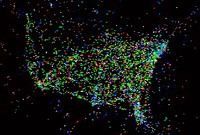
Sunday, October 11, 2009
A dynamic view of US air travel
This is another one of my occasional "It's not particularly about the web but hey, I found it on the web" posts.
Like this blog, the Astronomy Picture of the Day site occasionally includes entries that are not particularly on-topic. One such featured an animation of US-related air traffic over a period of about a day. Chasing a couple of links turned up a summary page including some very abstract views and a plot more closely reflecting the raw data.
It's a data-rich display that would make Tufte proud. Even from a static view you can make out major cities and the large-scale geography of the US and parts of South America (see also the comment about nematodes, of all things, at the bottom of this post).
With the added dimension of time, there are definite patterns, from an overall ebb and flow over the course of the day to the back-and-forth between the east coast and Europe, what I came to call "a short night over and a long day back": Eastbound flights tend to leave in the evening and arrive early the next day, while westbound flights tend to leave later in the morning and arrive early afternoon the same day.
The APOD version at first only seemed to show the westbound flights, but if you look more closely there's a generally eastbound fog early in the clip. I have no idea why the eastbound flights show up as fog, or why some occasionally squirm around disconcertingly and then even more disconcertingly disappear entirely, but whatever the cause of that, I found the raw dots version more informative as an animation. The processed version makes for better snapshots, though.
Meanwhile, back at the web, there's probably a version of this animation somewhere for internet traffic. I'd suspect some overall similarities, such as some times of day being busier than others and major cities getting more traffic, but it would be really interesting to consider the differences. Some possibilities that come to mind are
I'm sure the work has been done, but this was supposed to be an off-topic post and I can't be bothered right now to hunt up said work anyway.
Like this blog, the Astronomy Picture of the Day site occasionally includes entries that are not particularly on-topic. One such featured an animation of US-related air traffic over a period of about a day. Chasing a couple of links turned up a summary page including some very abstract views and a plot more closely reflecting the raw data.
It's a data-rich display that would make Tufte proud. Even from a static view you can make out major cities and the large-scale geography of the US and parts of South America (see also the comment about nematodes, of all things, at the bottom of this post).
With the added dimension of time, there are definite patterns, from an overall ebb and flow over the course of the day to the back-and-forth between the east coast and Europe, what I came to call "a short night over and a long day back": Eastbound flights tend to leave in the evening and arrive early the next day, while westbound flights tend to leave later in the morning and arrive early afternoon the same day.
The APOD version at first only seemed to show the westbound flights, but if you look more closely there's a generally eastbound fog early in the clip. I have no idea why the eastbound flights show up as fog, or why some occasionally squirm around disconcertingly and then even more disconcertingly disappear entirely, but whatever the cause of that, I found the raw dots version more informative as an animation. The processed version makes for better snapshots, though.
Meanwhile, back at the web, there's probably a version of this animation somewhere for internet traffic. I'd suspect some overall similarities, such as some times of day being busier than others and major cities getting more traffic, but it would be really interesting to consider the differences. Some possibilities that come to mind are
- I wouldn't expect the US/Europe traffic to follow the same pattern. With air travel, the net flux varies from heavily eastward to heavily westward through the day. With net traffic it probably varies less.
- With air travel, planes are (more or less) conserved. If n planes fly out of an airport in a given day, you'd expect about n planes to fly in as well, albeit maybe not the same planes. On the web, it's quite possible to send many more packets than you receive and vice versa. Homes, for example, typically receive far more traffic than they send, while servers are just the opposite.
I'm sure the work has been done, but this was supposed to be an off-topic post and I can't be bothered right now to hunt up said work anyway.
Saturday, October 10, 2009
Six degrees, more or less, sort of
In reference to a previous post on degrees of separation, I went looking through Wikipedia and found what I was pretty sure I'd seen before about graph theory and the "small world" phenomenon. A few points:
- Actual social networks, and a wide variety of similar networks from all sorts of different fields, don't act like classic random graphs, where each object in the network has about as many connections as any other. Rather, there tend to be a few objects with lots of connections and a lot with relatively few connections. But ...
- ... not a lot is known for certain, especially when it comes to networks of real live people. How connected people are depends on what kind of connections you count. There have been various efforts to measure connections in networks like FaceBook and from looking at instant messaging traffic (anonymized, I would hope!), but it's not clear what you can or can't tell about people in general from that. However ...
- ... networks in general seem to behave roughly similarly, keeping in mind that nice, regular networks are the exception both in theory and real life. In particular, as you add to the network, the diameter (the largest number of hops required to connect two objects in the network) tends to increase logarithmically. To double the diameter, you generally have to square the number of objects. One intriguing result is that if you start with a nice, regular network with a high diameter and add just a few connections here and there, the diameter drops sharply. So ...
- ... the "small world" phenomenon looks to be a general property of networks and not necessarily a product of our modern age. My hunch about human bandwidth is that there are only so many connections a person can keep up and that limit was hit quite some time ago. The question is more to what extent scattered groups of people might be more connected than in times past. And finally ...
- ... the famous "six degrees of separation" is not some sort of deep magic but rather a shorthand description of some early and not particularly rigorous experiments that suggested that most people are probably more or less six hops from each other. There's nothing particularly special about the number six, there are still small pockets of people who are not meaningfully connected to the outside world at all, and in any case the actual upper limit might just as well be twelve or five, depending on how you count (leaving isolates aside).
Thursday, October 8, 2009
Lulu, Wikipedia and vanity
I've been looking into Lulu.com lately, not because I plan to use it, but as part of my ongoing and mostly unsuccessful effort to understand how the web and print publishing interact. Along the way I had a look at the Wikipedia article on vanity presses. Immediately my spidey-sense tingled that something was amiss there. In particular, the article mixes vanity presses with on-demand printers. On-demand printers such as Lulu fit the definition given at the top of the article, since they don't screen authors, but they definitely don't fall under the more popular notion of a vanity press scam.
There's a pretty good summary of the problem in discussion page, under the heading This article is entirely wrong and defamatory to some of the organisations it references (no, tell 'em how you really feel). To understand the basic distinction, follow the money:
A vanity press pretends to be a publisher, but charges you in advance for what a publisher would normally do while not actually doing any of it. An on-demand printer does not claim to be a publisher (except in a limited sense described below), tells you exactly what they do and don't do and makes its money by taking a cut of whatever's actually printed and purchased.
From what I can see Lulu and company occupy a legitimate niche, allowing an author to bypass the screening process at the cost of assuming the marketing and editing duties. The author also forgoes any advance on royalties, thereby assuming some financial risk even without paying out of pocket. Printing costs are higher for on-demand publishing, but I doubt that's a major part of the picture compared to the other factors.
That said, if you're looking to self-publish, don't underestimate the value of the traditional publishing services. If you expect to sell purely on-line, you won't have to pay anything, but if you want to, say, sell physical books on a speaking tour, you'll have to buy the physical books. If you want your book listed on Amazon, you'll have to buy a distribution package from Lulu for $25-$75 plus the cost of a proof copy and make sure that your book meets certain distribution requirements. In any case you'll have to decide where to price your book, what the cover will look like, where and how to advertise it (at your own expense), etc., etc.
Caveat scriptor.
[I was going to write a follow-up for this, but on re-reading more closely it didn't seem like much had changed. Even the "entirely wrong and defamatory" screed is still on the talk page. Not every Wikipedia article has lots of eyes on it.
The basic analysis still holds, I think. There are three segments: traditional publishers, print-on-demand support for self-publishers and outright vanity presses. Where you put a company like Lulu depends on which dividing line seems more important. If you care about which way the money flows, Lulu is on the "real publishing" side. If you care about editing and marketing services, it's just another form of vanity/self-publishing.
This piece, linked by the current version of the Wikipedia article, falls rather caustically on the "just more vanity" side, but does give a list of several uses for print-on-demand, including yearbooks, technical how-to-manuals and "time limitations" --D.H. Dec 2015]
There's a pretty good summary of the problem in discussion page, under the heading This article is entirely wrong and defamatory to some of the organisations it references (no, tell 'em how you really feel). To understand the basic distinction, follow the money:
- In a vanity press scam, you pay the publisher. They run a small printing of your work at an exorbitant fee, send you the books and pocket the difference.
- With an on-demand printer, you upload your book and pay nothing. When people order it, they print it, ship it, send you a cut and keep a cut for themselves.
A vanity press pretends to be a publisher, but charges you in advance for what a publisher would normally do while not actually doing any of it. An on-demand printer does not claim to be a publisher (except in a limited sense described below), tells you exactly what they do and don't do and makes its money by taking a cut of whatever's actually printed and purchased.
From what I can see Lulu and company occupy a legitimate niche, allowing an author to bypass the screening process at the cost of assuming the marketing and editing duties. The author also forgoes any advance on royalties, thereby assuming some financial risk even without paying out of pocket. Printing costs are higher for on-demand publishing, but I doubt that's a major part of the picture compared to the other factors.
That said, if you're looking to self-publish, don't underestimate the value of the traditional publishing services. If you expect to sell purely on-line, you won't have to pay anything, but if you want to, say, sell physical books on a speaking tour, you'll have to buy the physical books. If you want your book listed on Amazon, you'll have to buy a distribution package from Lulu for $25-$75 plus the cost of a proof copy and make sure that your book meets certain distribution requirements. In any case you'll have to decide where to price your book, what the cover will look like, where and how to advertise it (at your own expense), etc., etc.
Caveat scriptor.
[I was going to write a follow-up for this, but on re-reading more closely it didn't seem like much had changed. Even the "entirely wrong and defamatory" screed is still on the talk page. Not every Wikipedia article has lots of eyes on it.
The basic analysis still holds, I think. There are three segments: traditional publishers, print-on-demand support for self-publishers and outright vanity presses. Where you put a company like Lulu depends on which dividing line seems more important. If you care about which way the money flows, Lulu is on the "real publishing" side. If you care about editing and marketing services, it's just another form of vanity/self-publishing.
This piece, linked by the current version of the Wikipedia article, falls rather caustically on the "just more vanity" side, but does give a list of several uses for print-on-demand, including yearbooks, technical how-to-manuals and "time limitations" --D.H. Dec 2015]
Tuesday, October 6, 2009
Is it OK to tweet "movie" in a crowded firehouse?
Last week the G20 met in Pittsburgh. Amid the obligatory protests, one person was arrested for using Twitter to tell protesters that the cops were coming. George Washington University law professor Paul Butler gave an analysis on NPR. From a Field Notes perspective, the key quotes are:
[I]ntent or motive is key. So if the government can prove beyond a reasonable doubt that the idea was to help the protesters evade the police and to prevent the protesters' illegal activities from being discovered, then they've broken the law. But that's a lot that the government will have to prove and, you know, it may be difficult based on the evidence. [Earlier, Butler argues that telling protesters where the cops are could just as well be aimed at helping them conform to the law by making sure they know where protests are and are not permitted].
[T]he law is used to adapting to new technology, you know, for - there was a time when the telephone was new. And then there was another time when computers were new. And people used these new instruments for both legal activity and for political organizing and sometimes for illegal activity. And what law has to do is to figure out the difference.From what I can make out, the gist is this: This particular case involving twitter touches on some very tricky issues of free speech, but the trickiness stems from the issue of free speech in general, not from the medium -- Twitter in this case. More specifically, the trickiness stems largely from the difficulty of proving intent, a difficulty not, so far, significantly affected by any known communication technology.
Monday, October 5, 2009
Doing math (or not) with Alpha
One of the pleasant surprises of the Baker's Dozen exercise was Wolfram Alpha. It didn't always come up with a full answer, but when it did, what an answer! So when I was browsing the Astronomy Picture of the Day and wanted to do a quick calculation, Alpha was the natural choice.
The question in question: In a 16-year tour de force, astronomers from the European Southern Observatory tracked the orbit of several stars around the center of the Milky Way [unfortunately, the video link appears broken]. From this, they confirmed the existence of a supermassive black hole there and measured its distance, based not on some chain of inferences involving standard candles and such (which also works and gives a consistent answer), but by pointing a telescope and watching things move. For sixteen years.
My question was, how good a telescope do you need to do that? The stars in question were on the order of light-days from the core, and the core is about 27,000 light-years away. Doing back-of-the-envelope calculations in my head and picking 2 light-days for reasons I don't remember, I made that to be around .02 arcseconds (the calculations aren't that hard, since for that small an angle you can easily ignore trig). But do double-check, I thought I'd ask Alpha.
For comparison, here's the same exercise with Google:
Now I just need to look up what kind of telescope you need to resolve hundredths of arcseconds (actually, you need considerably better to be able to plot the position of the stars in orbit and figure out the orbital elements, but at least it's a start). [Actually, you don't. 2 light-days is the closest point of a fairly eccentric ellipse. The full orbit is considerably bigger.][Alpha now has no problem with arctan((2 days) / (27,000 years)) in arcseconds, though it does think that 27 000 without the comma means 27 times 000 --D.H. May 2015]
The question in question: In a 16-year tour de force, astronomers from the European Southern Observatory tracked the orbit of several stars around the center of the Milky Way [unfortunately, the video link appears broken]. From this, they confirmed the existence of a supermassive black hole there and measured its distance, based not on some chain of inferences involving standard candles and such (which also works and gives a consistent answer), but by pointing a telescope and watching things move. For sixteen years.
My question was, how good a telescope do you need to do that? The stars in question were on the order of light-days from the core, and the core is about 27,000 light-years away. Doing back-of-the-envelope calculations in my head and picking 2 light-days for reasons I don't remember, I made that to be around .02 arcseconds (the calculations aren't that hard, since for that small an angle you can easily ignore trig). But do double-check, I thought I'd ask Alpha.
- I say (almost correctly): arc tan (27,000 years/2 days). Alpha thinks I mean tan-1(27, (0 years/2 days)).
- All right, take out the comma. Alpha says "Result: tan^(-1)(4927500)". Hovering over this I see the pointy hand indicating a link. So I click on it. Up comes a box that lets me cut and paste the text. Not quite what I was expecting. OK, so put that back into the entry box at the top
- Ah ... now I get a lot of results. A huge long decimal expansion, a conversion to degrees saying 90 degrees -- oops, I meant 2 days/27,000 years, not the other way around -- and then a bunch of alternate representations, including a continued fraction, integrals with gamma functions and other such. Well, Alpha does have its roots in Mathematica ...
- Fix the fraction, and try again, including the extra cut-n-paste. I get a similar display with a conversion to degrees: 1.163x10^-5deg. But I wanted arc seconds, so ...
- tan^(-1)(1/4927500) in arc seconds. It offers me "convert tan^(-1)(1/4927500) to arc seconds" to paste in, so ...
- For some reason I'm now getting back the same thing to paste in again. Before, I believe I got an answer in numbers.
For comparison, here's the same exercise with Google:
- arc tan (27,000 years/2 days) gives me a link to Did you mean: arctan (27,000 years/2 days)? Click the link:
- arctan((27 000 years) / (2 days)) = 1.57079612 Now that's more like it. Fix the fraction and ask for the units:
- arctan (2 days/27,000 years) in arcseconds gives arctan((2 days) / (27 000 years)) = 0.0418321722 arcseconds.
Now I just need to look up what kind of telescope you need to resolve hundredths of arcseconds (actually, you need considerably better to be able to plot the position of the stars in orbit and figure out the orbital elements, but at least it's a start). [Actually, you don't. 2 light-days is the closest point of a fairly eccentric ellipse. The full orbit is considerably bigger.][Alpha now has no problem with arctan((2 days) / (27,000 years)) in arcseconds, though it does think that 27 000 without the comma means 27 times 000 --D.H. May 2015]
Thursday, October 1, 2009
Linking my way to fame and fortune
As I may have mentioned, I'm not exactly a social networking party animal (more a party vegetable, really), but I happened to log back into LinkedIn after I'm-not-sure-how-long and lo and behold, I'm a 3rd-degree connection to the President of the United States himself.
I doubt this puts me in particularly distinguished company. LinkedIn itself appears to be on a first-name basis with the prez, and tells me that "Barack's connections" number "500+".
Alas, "Barack Obama is not currently open to receiving Introductions or InMail™" so I doubt I'll be joining that select 500+ anytime soon.
A few statistics about my own network may make the three degrees of separation somewhat less surprising. Keep in mind that I haven't tried particularly hard to make connections. They just seem to accumulate:
There are approximately 45 million LinkedIn users overall, making it a proper megacommunity by my earlier definition. If we assume that being two degrees from one person is independent of being two degrees from another -- a dicey assumption for a number of reasons -- then the POTUS's 2nd-degree connections would number about half that, or 22 million+, based on about half of my connections being his 2nd-degree connections.
That's not completely implausible, but it's also possible that through the luck of the draw I'm connected to a cluster of people with somewhat closer than usual ties to the president. Nonetheless, if you're an active social networker with 500+ connections yourself, your odds of being 2nd-degree or closer look pretty good. The odds of any random LinkedIn member being in my position also look quite good.
Likewise, the purely random model would suggest that about 1/3,000th of Barack's connections would be two degrees from me, so likely a handful of people, maybe just one, depending on just how far over 500 the number really is. Again plausible, but again, we're not dealing with strictly random samples.
Paul Erdős, Alfréd Rényi, Béla Bollobás and others proved some very interesting results about random graphs starting in 1959, but social network graphs don't appear to fit the usual model. I recall running across more relevant work while trolling through Wikipedia a while ago. I might have to go back for another look. [There's more on social network graphs here and here --D.H. Dec 2015]
So, does this demonstrate the awesome power of social networking, that a random none-too-social geek can find himself three steps away from one of the world's most influential offices? Well, just what use am I meant to make of this connectivity beyond getting a longer-than-expected blog post out of it? Whatever use I might want to put it to, pretty much the rest of LinkedIn has the same shot if not better. I and the rest of the teeming masses can't see Obama's connections, or send him InMail, or do anything else particularly impressive. In other words, we're in about the same situation as any other private citizen of the US, which is where we were without LinkedIn.
There's a general principle at work here: You can't deliver privileged access to everyone.
I doubt this puts me in particularly distinguished company. LinkedIn itself appears to be on a first-name basis with the prez, and tells me that "Barack's connections" number "500+".
Alas, "Barack Obama is not currently open to receiving Introductions or InMail™" so I doubt I'll be joining that select 500+ anytime soon.
A few statistics about my own network may make the three degrees of separation somewhat less surprising. Keep in mind that I haven't tried particularly hard to make connections. They just seem to accumulate:
- I have 83 direct connections.
- About a dozen of those have 500+ connections.
- 43 of the 83, so just over half, are two degrees from Obama
- I have 14,000+ 2nd-degree connections and about 1.4 million 3rd-degree connections.
- So many direct connections you need a staffer to keep them straight
- Given the nature of politics, dozens if not hundreds of those have 500+ connections. Granted, there's going to be a lot of overlap.
There are approximately 45 million LinkedIn users overall, making it a proper megacommunity by my earlier definition. If we assume that being two degrees from one person is independent of being two degrees from another -- a dicey assumption for a number of reasons -- then the POTUS's 2nd-degree connections would number about half that, or 22 million+, based on about half of my connections being his 2nd-degree connections.
That's not completely implausible, but it's also possible that through the luck of the draw I'm connected to a cluster of people with somewhat closer than usual ties to the president. Nonetheless, if you're an active social networker with 500+ connections yourself, your odds of being 2nd-degree or closer look pretty good. The odds of any random LinkedIn member being in my position also look quite good.
Likewise, the purely random model would suggest that about 1/3,000th of Barack's connections would be two degrees from me, so likely a handful of people, maybe just one, depending on just how far over 500 the number really is. Again plausible, but again, we're not dealing with strictly random samples.
Paul Erdős, Alfréd Rényi, Béla Bollobás and others proved some very interesting results about random graphs starting in 1959, but social network graphs don't appear to fit the usual model. I recall running across more relevant work while trolling through Wikipedia a while ago. I might have to go back for another look. [There's more on social network graphs here and here --D.H. Dec 2015]
So, does this demonstrate the awesome power of social networking, that a random none-too-social geek can find himself three steps away from one of the world's most influential offices? Well, just what use am I meant to make of this connectivity beyond getting a longer-than-expected blog post out of it? Whatever use I might want to put it to, pretty much the rest of LinkedIn has the same shot if not better. I and the rest of the teeming masses can't see Obama's connections, or send him InMail, or do anything else particularly impressive. In other words, we're in about the same situation as any other private citizen of the US, which is where we were without LinkedIn.
There's a general principle at work here: You can't deliver privileged access to everyone.
Subscribe to:
Posts (Atom)

