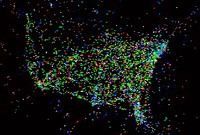
Like this blog, the Astronomy Picture of the Day site occasionally includes entries that are not particularly on-topic. One such featured an animation of US-related air traffic over a period of about a day. Chasing a couple of links turned up a summary page including some very abstract views and a plot more closely reflecting the raw data.
It's a data-rich display that would make Tufte proud. Even from a static view you can make out major cities and the large-scale geography of the US and parts of South America (see also the comment about nematodes, of all things, at the bottom of this post).
With the added dimension of time, there are definite patterns, from an overall ebb and flow over the course of the day to the back-and-forth between the east coast and Europe, what I came to call "a short night over and a long day back": Eastbound flights tend to leave in the evening and arrive early the next day, while westbound flights tend to leave later in the morning and arrive early afternoon the same day.
The APOD version at first only seemed to show the westbound flights, but if you look more closely there's a generally eastbound fog early in the clip. I have no idea why the eastbound flights show up as fog, or why some occasionally squirm around disconcertingly and then even more disconcertingly disappear entirely, but whatever the cause of that, I found the raw dots version more informative as an animation. The processed version makes for better snapshots, though.
Meanwhile, back at the web, there's probably a version of this animation somewhere for internet traffic. I'd suspect some overall similarities, such as some times of day being busier than others and major cities getting more traffic, but it would be really interesting to consider the differences. Some possibilities that come to mind are
- I wouldn't expect the US/Europe traffic to follow the same pattern. With air travel, the net flux varies from heavily eastward to heavily westward through the day. With net traffic it probably varies less.
- With air travel, planes are (more or less) conserved. If n planes fly out of an airport in a given day, you'd expect about n planes to fly in as well, albeit maybe not the same planes. On the web, it's quite possible to send many more packets than you receive and vice versa. Homes, for example, typically receive far more traffic than they send, while servers are just the opposite.
I'm sure the work has been done, but this was supposed to be an off-topic post and I can't be bothered right now to hunt up said work anyway.


No comments:
Post a Comment